Week 6: From Ugly Prototype to Something Users Might Actually Like
How Lumi's early Flutter interface moved from rough prototype to a clearer, calmer experience through AI-assisted design iteration.
Build in Public - Week 6 (May 25-31)
The first version of Lumi’s UI was what you’d expect from a product person who had never built a mobile interface before. Default Flutter widgets, no color scheme to speak of, buttons placed wherever they happened to land on the screen. It worked, barely, but no one would have described it as pleasant to use.
I knew this was a problem. A reminder app could have the best AI in the world, but if it looked like a college project, people wouldn’t take it seriously. The question was how to fix it without hiring a designer, which, as a solo developer with no budget, wasn’t an option.
The answer, as it had been for most of my technical problems, was AI tools. I asked several different AI assistants for UI advice, described what Lumi did and who it was for, and asked them to suggest layouts, color schemes, and interaction patterns. Each one gave me a different answer, which was frustrating at first, but turned out to be useful. I could pick the best ideas from each and combine them.
The Real Work Was Claude
After gathering advice, I turned to Claude to do the actual UI implementation. I described what I wanted screen by screen, and Claude generated the Flutter code. The first versions were rough: layouts that didn’t quite align, colors that clashed, text that overflowed. But with each iteration, the UI got better. I’d test it on my phone, find three things that looked wrong, describe them, and Claude would fix them.
The most important changes were structural: bottom navigation so users could switch between tasks, calendar, and settings; card-based task display that made it easy to scan upcoming reminders; and a conversation view that felt natural rather than technical. The color scheme settled on green, not because I had a strong opinion about it, but because green felt calm and health-oriented, which fit the product’s target audience.
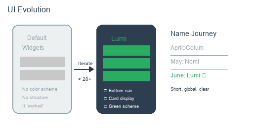
The journey from default Flutter widgets to a more intentional design
The Name Journey
This week was also when I finally settled on a name for the app. It had changed several times before: early notes called it “Colum,” then it became “Nomi” for a while. Neither felt right. Colum sounded like a medical device. Nomi was too similar to other apps on the market.
Lumi came from thinking about what the product should feel like. It’s short, easy to pronounce in different languages, and carries a sense of clarity: light, illumination, making things visible. For a reminder app that helps you see what you need to remember, that felt right. The domain was available, the Google Play listing wasn’t taken, and the name didn’t conflict with any existing products. Lumi it was.
What Doesn’t Change
The UI improvements were important, but I tried to keep one principle in mind: visual polish should never come at the expense of simplicity. A reminder app doesn’t need fancy animations, complex navigation, or innovative gestures. It needs to be clear, reliable, and fast. Every design decision I made was tested against that standard. If a visual element didn’t help the user create or check a reminder faster, it didn’t belong.
What I Learned
Week 6 showed me that you don’t need to be a designer to build a good-looking interface. You need good tools, a willingness to iterate, and the honesty to admit when something doesn’t work. AI tools gave me the ability to generate and refine UI code without hiring a specialist. The iteration cycle, describe, generate, test, refine, became the core of how I built everything, not just the interface.